Visualizing the Differences In L1-norm and L2-norm Loss Function
In an earlier post about the differences between L1 and L2 as loss function and regularization, one of the graph about L1-norm and L2-norm loss function is rather confusing to many readers, as I have seen from the comments. Reviewing it after a year, it wasn’t very clear as well, so today I generated some data and run a model over them. Here is how it looks like:
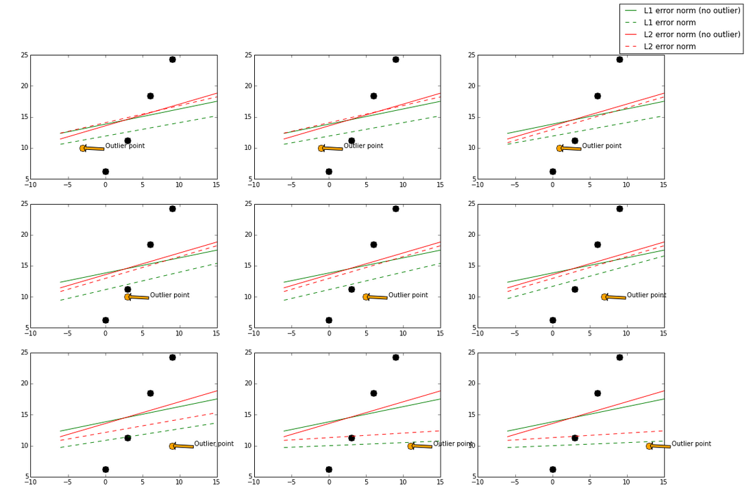
The base model here used is a GradientBoostingRegressor, which can take in L1-norm and L2-norm loss functions. The green and red lines represent a model using L1-norm and L2-norm loss function respectively. A solid line represents the fitted model trained also with the outlier point (orange), and the dotted line represents the fitted model trained without the outlier point (orange).
I gradually move the outlier point from left to right, which it will be less “outlier” in the middle and more “outlier” at the left and right side. When the outlier point is less “outlier” (in the middle), L2-norm has less changes while the fitted line using L1-norm has more changes.
In the case of a more “outlier” point (upper left, lower right, where points are to the far left and far right), both norms still have big change, but again the L1-norm has more changes in general.
By visualizing data, we can get a better idea what stability is with respective to these two loss functions.
The code that generates this plot can be found here, and online iPython Notebook link here.